Yes, much better. Much, much, much better! The colour scheme is powerful, the image provides a focus, and I get a sense of what kind of book this may be. To me, the choice is very clear: the new version is The One. :-)
I would say that this cover is much better than the cover from the other day. Adding in the silhouette is very nice. However, I'm still not 100% sure what the books is about. Mystery? Thriller? I think that it needs just a little something more to make things more clear.
A huge improvement but just looking at it I still wouldn't know if it is romance/thriller, thiller, mystery, paranormal or what. I might GUESS thriller, but I agree with Eric that it needs at least another small element to show the genre.
Agreed on the "much, much better." Somehow the woman's silhouette is very "sexy pose" which I think may be why the genre is still confusing. She doesn't look like a detective, she looks more like a stripper or something (sorry). But still, big, big improvement.
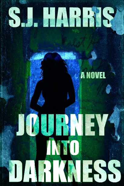
The silhouette of the girl gives e the idea that there's a girl in the story, maybe. Not sure if this is going for abstract symbolism.
ReplyDeleteI'm guessing thriller, maybe.
Yes, much better. Much, much, much better! The colour scheme is powerful, the image provides a focus, and I get a sense of what kind of book this may be.
ReplyDeleteTo me, the choice is very clear: the new version is The One.
:-)
Back from my long business trip -
ReplyDeleteI would say that this cover is much better than the cover from the other day. Adding in the silhouette is very nice. However, I'm still not 100% sure what the books is about. Mystery? Thriller? I think that it needs just a little something more to make things more clear.
A huge improvement but just looking at it I still wouldn't know if it is romance/thriller, thiller, mystery, paranormal or what. I might GUESS thriller, but I agree with Eric that it needs at least another small element to show the genre.
ReplyDeleteHowever, it is already much, much better.
Agreed on the "much, much better." Somehow the woman's silhouette is very "sexy pose" which I think may be why the genre is still confusing. She doesn't look like a detective, she looks more like a stripper or something (sorry). But still, big, big improvement.
ReplyDeleteWould it be possible to replace 'A NOVEL' with the genre? For example, 'A THRILLER' or 'ROMANTIC SUSPENSE' or whatever? This would solve the problem.
ReplyDeleteThanks so much for the feedback. Very helpful!
ReplyDelete