a critique site for book lovers, hosted by author Jude Hardin
Tuesday, March 29, 2011
Roll of the Die by Sean P.Bridges
What's the genre? What is it you like or don't like about this cover? Does it make you want to know more about the book? Does it make you want to BUY the book? Discuss.
I'm guessing murder mystery, and the title is a play on 'die' as in be dead. All the wispy stuff around the title in distracting, but the black and white looks good with just the splash of red. I'm a murder mystery fan, so I'd pick this up.
I don't care for all the scroll work in the title. Some would be okay, but I think there's too much. It makes it hard to make out the title.
Otherwise, I think this is really good. I like the black on white with the red dice. And I like the border so that it will have defined edges when displayed on a white background.
I would pick this one up and read the description. Good job.
I'm guessing murder mystery at a tattoo parlor or possibly, a gang of gambling bikers' murder mystery.
The splotches of ink around the lettering is artsy but a little distracting. I'm torn about it. I think I agree with the others. It probably should be toned down.
The grunge-style frame, the curlicues, the cartoony dice, and the skull (the curly bits make it look like it's having a bad hair day) make me think this is a mystery involving gambling, with a twist of dark comedy, with the chance of paranormal activity. The typography looks a little busy, but it's easy to read even at thumbnail size. I'd probably pick it up and at least read the blurb.
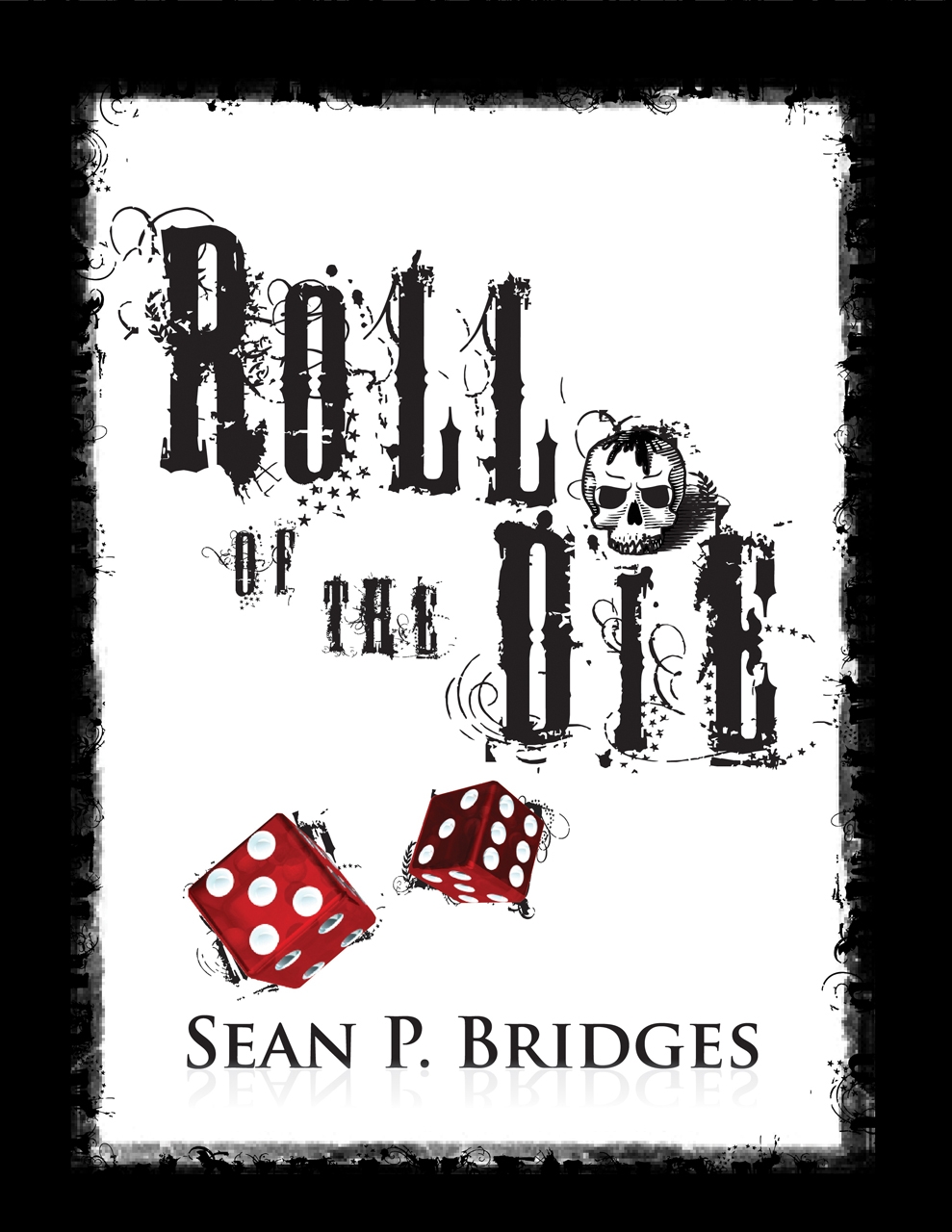
Just based on the cover I would guess that it's a thriller / gritty crime drama.
ReplyDeleteI like this cover with good simple contrast of good old black text on a white background. Then there is just the spot of color from the red dice.
I'm not 100% sure that I like all the extra scroll work around the lettering. There seems to be an excess between the R and O.
Crime thriller, possibly involving street gangs or bikers. It looks nice, but I think the title should be a little higher up.
ReplyDeleteAnd I hate to nit-pick, but "die" is singular but the picture is of two dice.
I'm guessing murder mystery, and the title is a play on 'die' as in be dead. All the wispy stuff around the title in distracting, but the black and white looks good with just the splash of red. I'm a murder mystery fan, so I'd pick this up.
ReplyDeleteI don't care for all the scroll work in the title. Some would be okay, but I think there's too much. It makes it hard to make out the title.
ReplyDeleteOtherwise, I think this is really good. I like the black on white with the red dice. And I like the border so that it will have defined edges when displayed on a white background.
I would pick this one up and read the description. Good job.
I'm guessing murder mystery at a tattoo parlor or possibly, a gang of gambling bikers' murder mystery.
ReplyDeleteThe splotches of ink around the lettering is artsy but a little distracting. I'm torn about it. I think I agree with the others. It probably should be toned down.
Definitely mystery, but I'm with the others. I don't really like the scrollwork on the lettering. That being said, I'd still pick this one up.
ReplyDeleteI would definitely pick this up. Love the little skull dotting the i!
ReplyDeleteThe grunge-style frame, the curlicues, the cartoony dice, and the skull (the curly bits make it look like it's having a bad hair day) make me think this is a mystery involving gambling, with a twist of dark comedy, with the chance of paranormal activity. The typography looks a little busy, but it's easy to read even at thumbnail size. I'd probably pick it up and at least read the blurb.
ReplyDelete